Here at Black Hops the design process is something that we love! So we’ve recently been shining the spotlight on some of the designers we collaborate with for our beer can designs.
In our first Design Spotlight series we got to know Troy Cochrane of Troy Designs, who has designed over 30 beer cans for us. Check it out here.
Our second can designer in the series was Daniel Ricafrente, a 2D animator-illustrator based in the Philippines, whose first design for us was for one of our first GABS beers, Bandwagon Dessert Stout.
Time to meet our next designer in this series.
Dave Heavyside
Dave first came on board as one of our can designers in 2020, initially coming up with the designs for the four birthday beers which were released to commemorate the 4th birthday of our Burleigh taproom & brewery (HQ). In fact his very first can design, for Murder Hornet Black IPA, took out fifth place at the 2021 GABS Can Design Awards!
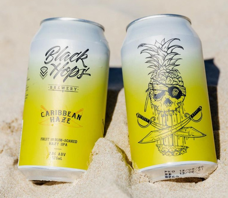
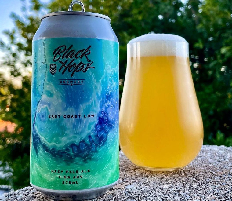
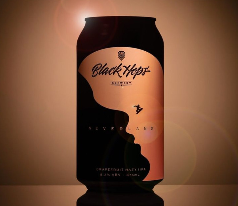
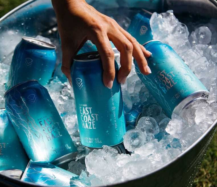
Since then he’s gone on to design a further 33 cans for us, including the striking Caribbean Haze and Neverland IIPA limited release cans as well as our most recent core range beer, East Coast Haze.
Here is an interview with Dave and a few stories around how some of these designs came to be.
It’s cool to think about how easily and organically the design process can be with such a flexible product and a talented designer.
East Coast Haze
Dave messaged me once and said ‘I want to do a beer label inspired by East Coast Low, the weather system that drives the swell events on the gold coast. I said cool you design something we’ll make a beer that’s a lower ABV version of our hazy and call it East Coast Low. The design was fun and we released it as a limited release. This was the design at the time.
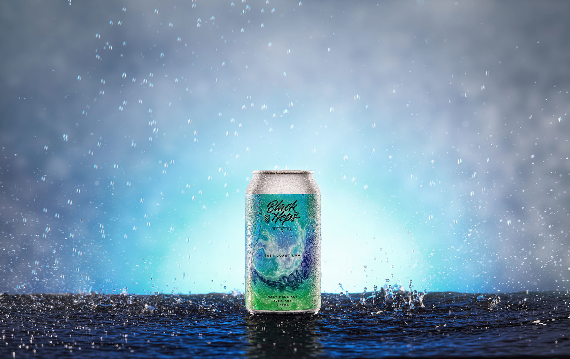
A few months later we decided we wanted to release it into our core range realising an opportunity to compliment our Pale Ale and higher ABV Hazy, G.O.A.T. we wanted the word ‘Haze’ in the name and didn’t think the word ‘Low’ was all that inspiring. The beer was all about good times, good weather, surf etc but East Coast Low was effectively about bad weather plus we thought the word ‘Low’ would have people assuming it was a light low ABV beer. So I went back to Dave and asked him to re-do the design, effectively changing it completely. And this time it would be a fully printed can and it would be a stand alone design that would go straight into our core range, backed up by a massive marketing campaign.
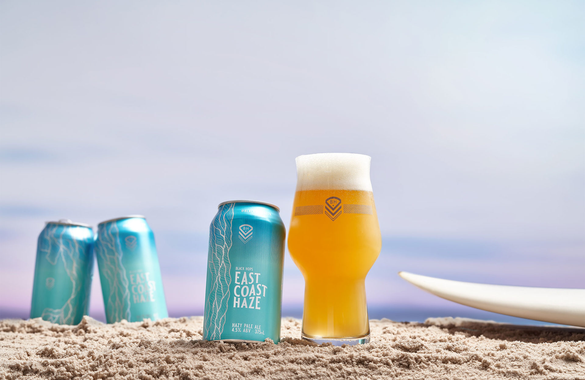
He completely nailed the design and within months East Coast Haze was launched and became (and continues to be) our highest selling product.
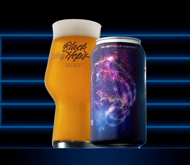
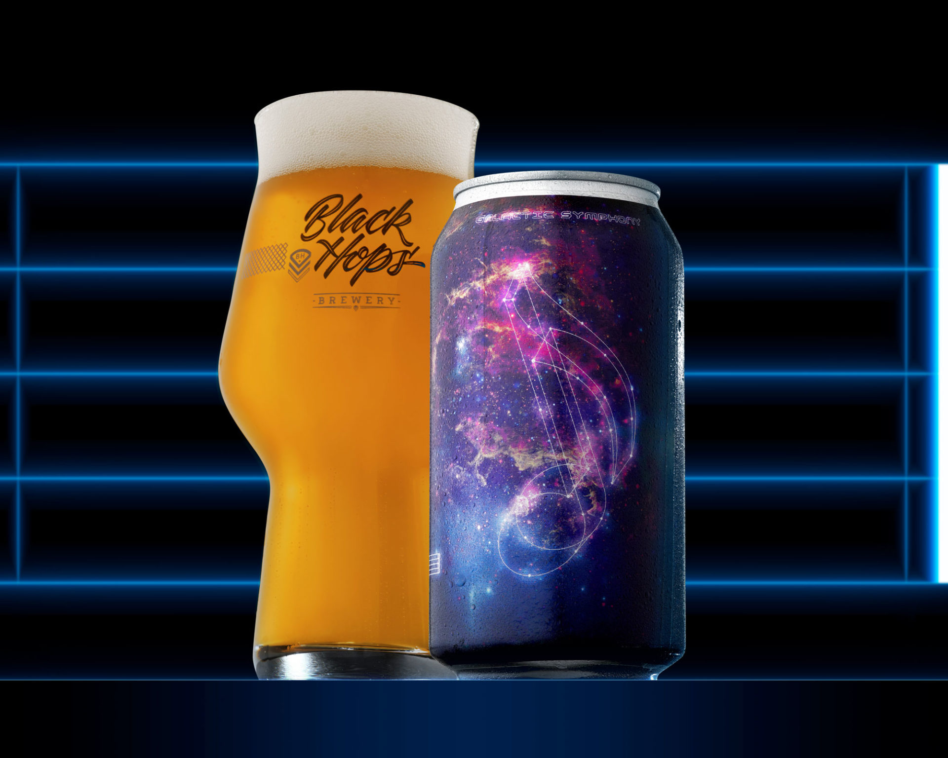
Galactic Symphony
I think this is one of our best can designs and it happened pretty randomly. In early 2022 I was randomly reading a magazine when I stumbled across an article about a lightsail. Lightsails are a proposed method of spacecraft propulsion using radiation pressure exerted by sunlight on large mirrors. But more importantly the image looked extremely cool.
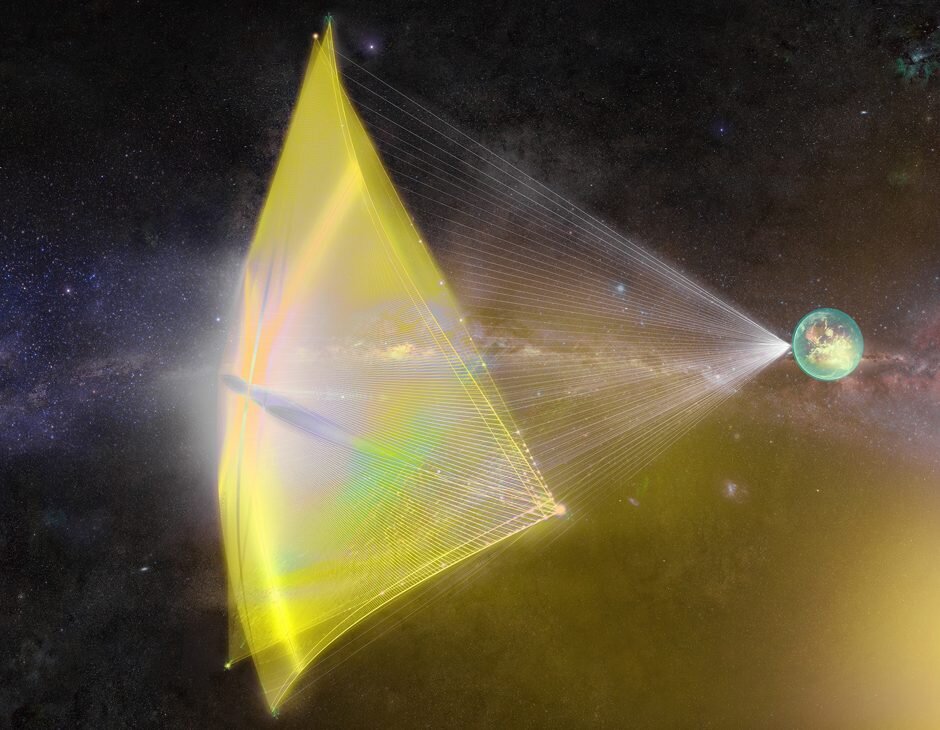
Then I started thinking about those images of the SpaceX launches which were also super cool.

I messaged Dave and asked if he could come up with a concept for a design based around these 2 things for a new limited release beer that we would call Cosmic Symphony or Galactic Symphony (that name just came to me not sure how, hopefully I didn’t steal it from someone without knowing!). We brainstormed beer ideas and decided on a version of our previously-released Troposphere beer which featured Galaxy and Strata hops, but this time we’d do a hazy version and include our latest favourite hop Eclipse. The idea was a symphony of astrology-themed hops but Dave took it one step further gaining inspiration from the theme some from Close Encounters of the Third Kind to come up with a really fun looking can that I reckon is one of our best.
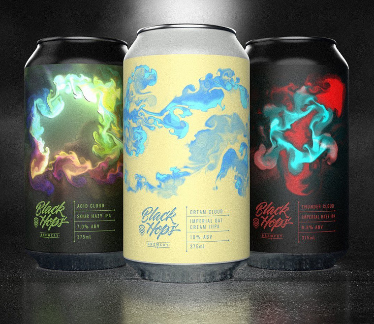
Cloud Series beers
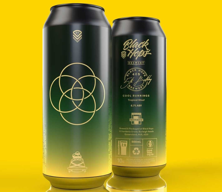
Dave came up to me once at the taproom once and said ‘hey I’ve been playing around with this app on my phone that does these crazy cloud like patterns, we should do a series of beers using the patterns it would look cool’. I told him we had a beer called Thundercloud that we’ve done before without a full design, we had one we are about to re-release called Cream Cloud and then another sour hazy we are looking for a name for, we could call that Acid Cloud and there’s the 3 cloud beers. Dave designed the cans, we released the beers and that was that.
OK let’s hear from the man himself.
Getting To Know Dave
How did you get into the design game?
I’ve been designing / drawing as long as I can remember. I was fascinated with drawing cars and planes as a kid, and then I won a Basketball Jersey design competition for a magazine when I was about 12 years old. Through high school I ended up designing the logo and promotional material for my band and also the logo, posters, merch and promo material for a music festival that a few mates started that grew from a small one day festival with a couple hundred people and ended up in multiple sold out shows in huge venues in Adelaide and Melbourne. I went to Uni to study Industrial Design, to chase my dream of being a car designer, but ended up dropping out to pursue a cricket career overseas for a few years. On my return I went back to study and completed an advanced diploma in Advertising and Graphic Design at TAFE in SA, and worked as a freelance graphic designer for a few years while I built up my portfolio.
During that time I was lucky enough to help out as a junior designer at Custom Kit Car Magazine and really enjoyed that side of design. Magazines were still a thing in the late 2000s and I was a subscriber of Riptide, a bodyboarding magazine published by Morrison Media up on the Gold Coast. I had always loved the design of that mag and considered it a bit of a dream job, so after pestering them for work experience and entering every design comp they had, I was fortunate enough to get an intro call with Gra (Graeme Murdoch) the creative director and absolute design legend. That call eventually led to an offer to come and take up a design role at Morrison Media in late 2009 – a move which completely changed my life.
My professional journey as a designer really started then, and over the next 5 or so years I would end up owning Riptide Magazine itself (A story for another time!) and after a reshuffle or two, eventually finding myself working out of the offices of 7th Vision – a web design company on the lower floor of the Morrison Media building in Burleigh Heads. It just so happened that around that time 3 mates on the Gold Coast decided they would start a brewery in the sheds a couple doors down. That’s how I met Dan, Govs and Eddie and the rest is history I suppose!
However, I didn’t actually design my first label for Black Hops until 4 years later…
From a design perspective who are a few of your greatest role models/inspirations?
I never really had a particular inspiration, I just loved things that looked cool – F1 fighter jets, sports cars, tanks, sailing ships, space vehicles, Anime, music, album covers, cartoons, video games – anything that grabbed my imagination. I never really had a “style” it was just whatever worked for what I was doing. I think that shows through in my vastly different approach to all the can labels I’ve designed.
How did you end up designing beer cans for Black Hops?
After I had to wrap up Riptide magazine due to a collapse in magazine sales and the rise of Social Media, I found myself at MAAKE, a creative agency here on the Gold Coast that worked with the major alcohol brands like XXXX, Heineken, Furphy etc. I was creating marketing and brand activations for those brands, but was only working with existing assets from the global brand teams, not actually designing anything outright, more just laying things out. Itching to be a bit more creative, I reached back out to Dan and just asked if he had any cans that he needed designing and he said “Sure, we have our 4th birthday coming up we need 4 designs for.. you keen?” – I said sure, send me a brief and that’s how it all got rolling. The first 4 cans I designed were Black Forest Birthday Cake, Birthday Sundae, Zappy Birthday and Murder Hornet.
Can you briefly run through the process of how you work with Black Hops to come up with the BH can designs?
Ok, this is gonna sound crazy, but it’s usually one text from Dan with “hey, the beers called this” or “Hey, the beer is this” and then either a one line of some high level idea or sometimes not even that. Sometimes I just send him an idea for a design – that’s how East Coast Haze was born. It’s a really fluid process. I love designing them and Dan, Reanna and the Black Hops team are awesome to work with.
Comment from Dan: This also happened with the cloud series of beers, Dave came up to me once at the taproom once and said hey I’ve been playing around with this app on my phone that does these crazy cloud like patterns we should do a series of beers using the patterns it would look cool. I said sounds good we have a beer called Thundercloud that we’ve done before without a decent label, we have one we are about to release called Cream Cloud and then we have another sour hazy we are looking for a name for, we could call that Acid Cloud and there’s the 3 cloud beers. Dave designed the cans, we released the beers and that was that.
Do you have a personal favourite Black Hops can design that you came up with?
I have a few favourites.
Murder Hornet: this was my first ever Black Hops can design and ended up coming in 5th at the 2021 Gabs Can design awards.
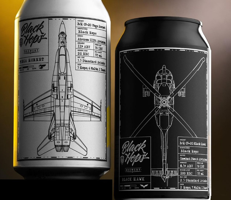
Mega Hornet and Black Hawk: Probably the most unique design I’ve done to date on a can, but also one of the best received designs. As a pair they reminded me of my model building days and poring over fighter plane blueprints as a kid. They also got picked up by the Defence community as a bit of a fan favourite for those who had flown in the Black Hawk as service men and women in particular. That was pretty cool to see.
East Coast Haze: The whole story is great – starting out as East Coast Low and being the first Black Hops beer to have a completely new label and also its own huge launch campaign complete with billboards, caravans, surfboards and skateboards. To see it end up as a core range beer was amazing and completely surreal.
Related: How East Coast Haze Went Core
Special Mentions: Neverland, Caribbean Haze, The Cloud Series.
Who are a few of your other clients?
I’ve never designed a beer label for anyone else! But I have worked as a creative director on brands such as XXXX, Furphy, Heineken, Hahn, Little Creatures, James Boags, Iron Jack, Kirin, Penfolds, Wolf Blass, 19 Crimes, Pepperjack and other in the Lion and Treasury Wines portfolio.
I am currently head of product at Stadius, a web3 startup, so I’ve taken a break from label designs for now, but would love to do another again soon.
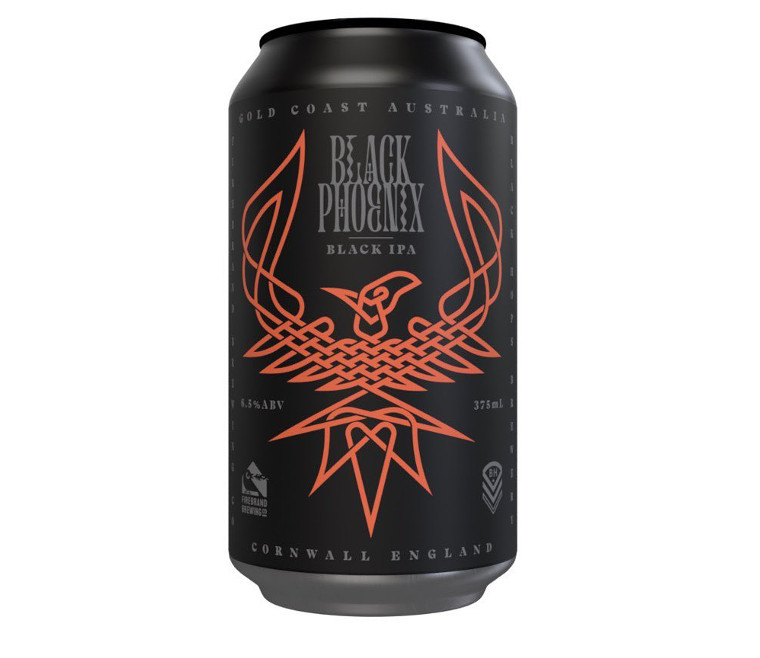
Key Can Focus: Murder Hornet (9.2% Black Imperial Hornet IPA)
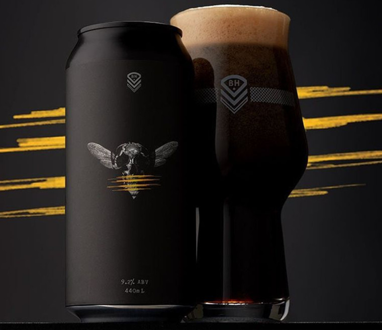
The annual GABS Can Design Awards are held in recognition of the fine art of designing a killer craft beer can.
Our 2021 entry was for our limited release Murder Hornet Black IPA can, which Dave designed for our Burleigh Taproom 4th birthday celebrations. Over 140 breweries entered the awards and once the votes were tallied we were stoked to finish once again as a top 10 finalist, making it 2 years in a row. From there a judging panel came up with the final rankings and we managed to finish in fifth position.
Murder Hornet was the first design we got Dave on board for. This can was a bit of a change in direction for us, but Dave absolutely nailed it. In his words; “Maintaining a fine balance of complexity and simplicity was key to this design working, and having the impact that we wanted it to have as the flagship beer of the BH 4th Birthday Series.”
Related: Taking Murder Hornet To The Can Design Awards
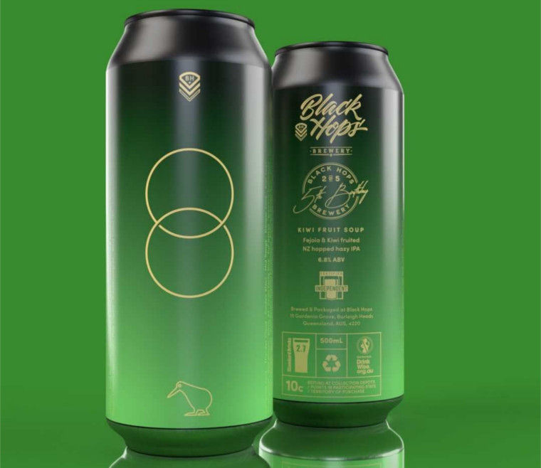
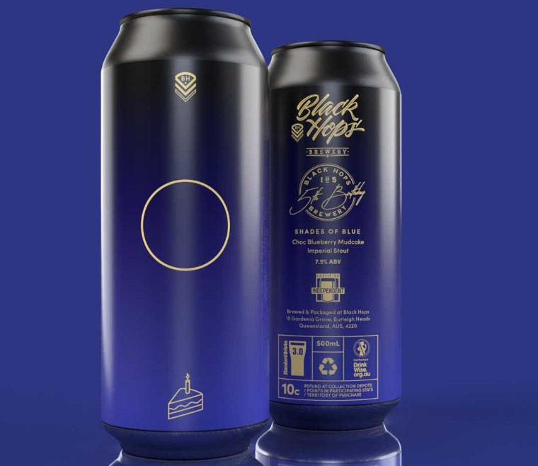
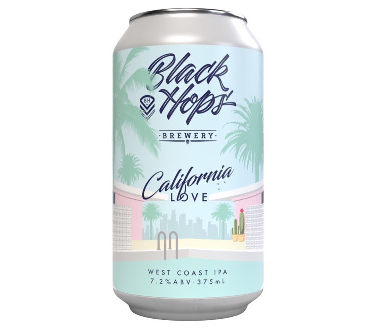
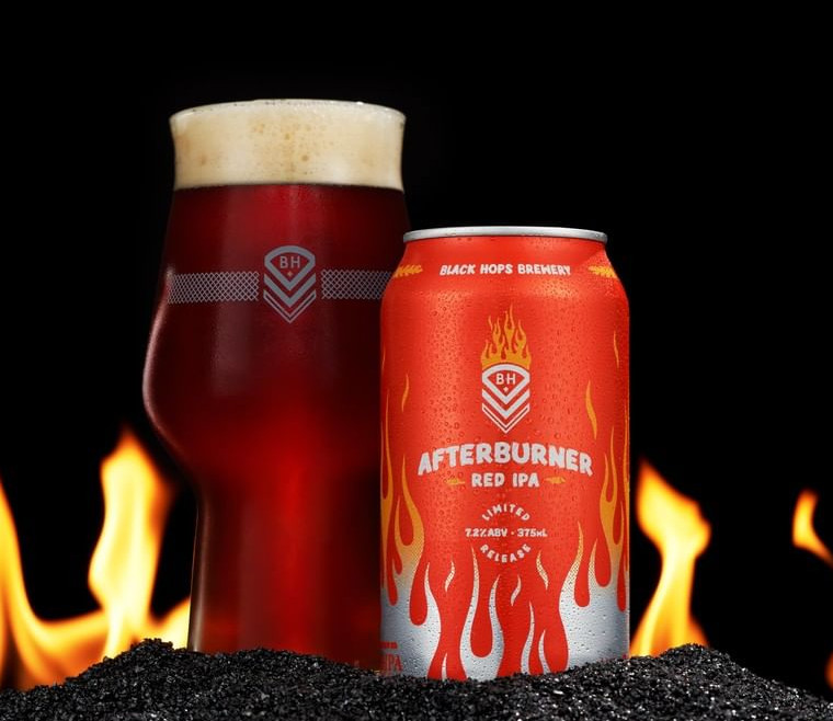
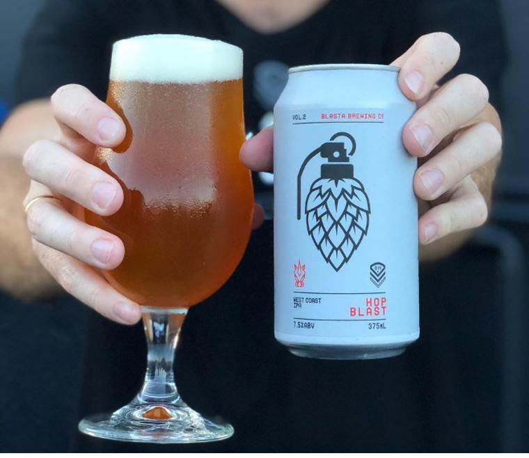
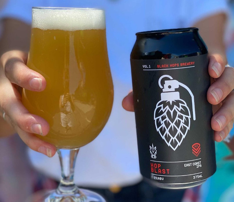
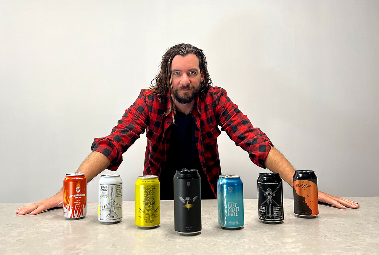
Dave’s Black Hops Can Designs
Here’s a gallery of Dave’s Black Hops can designs – scroll down to see them all and click on the images to enlarge them.