Early April sees us hitting two significant milestones in the history of Black Hops Brewing. Our very first Pale Ale will be officially available, and it will be our first beer to come in cans..boom boom!! The beer itself is 4.8%, light in colour but big in tropical flavours. It’s the Black Hops beer for every beer drinker.
Pale Ale – you can’t get any more to the point than calling a beer exactly what it is! This was a bit of a shift for us, as the names of most of our beers tend to revolve around military themes, such as Hornet, Code Red or Pink Mist, which ties in with the brewery name. This time we decided to be a little less ‘clever’ and let the name describe the beer.
But the name was only part of the challenge. Branding the beer was a much bigger challenge, for a few reasons:
- We’d put a lot of effort into branding our bottles and the design we had done there really didn’t translate across to the can.
- When we design a can you basically have 2 choices. Print a label or print the can itself. Printed cans have a minimum order of 60,000 so if we were to print can designs for all of our beers we are talking hundreds of thousands of cans.
- We also had to think about how to position the beers as something a bit different to the standard carton of beer. Craft beer has become too expensive for the average person to buy full cartons, so we had to re-think how to sell it.
Here’s how we went about designing both the cans and the cartons.
Can design
So we needed a new design. We didn’t really love the look of labels on cans so we decided to do a hybrid approach. A generic printed can, with individual labels for the beer itself, leaving the option open for us to easily do other beers down the track.
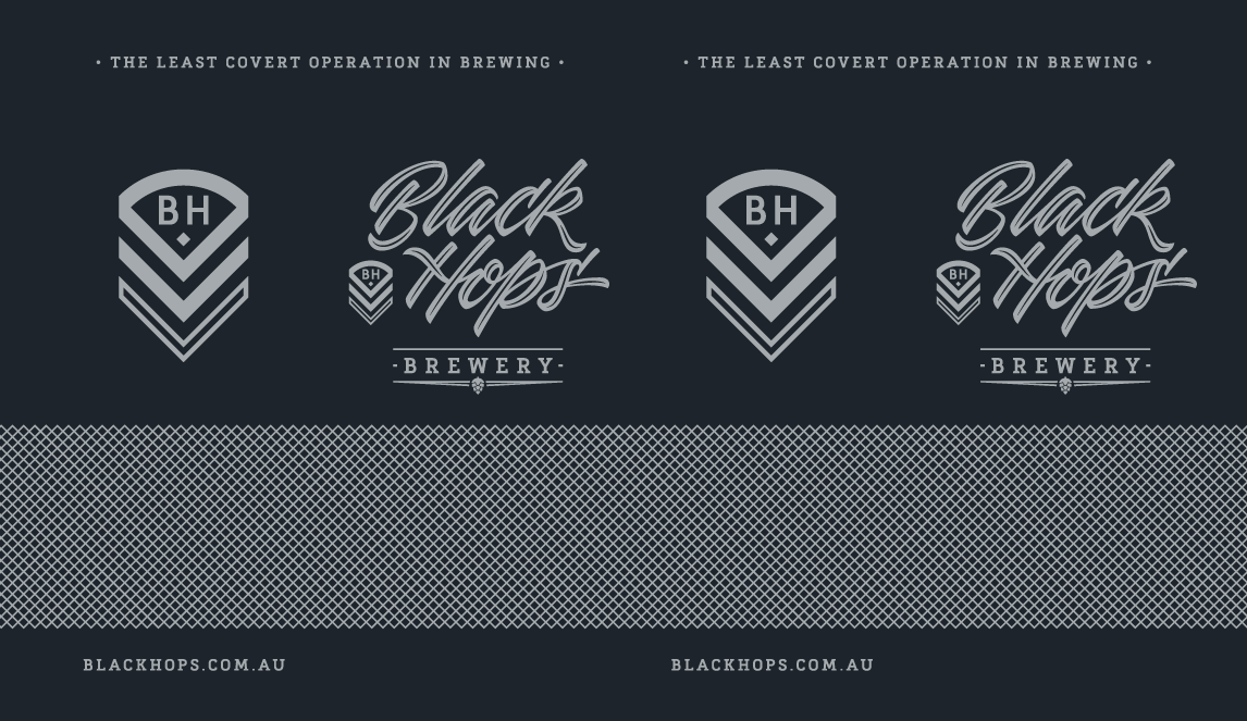
To represent Pale Ale in it’s best light we needed our packaging to step up and deliver. Enter Matt Vergotis, who we’ve worked with on branding and design across the entire Black Hops journey. Matt is a legend and a complete gun when it comes to nailing every design and branding challenge we’ve thrown his way.
Related: Operation Brewery podcast episode with Matt
So let’s start with the can design. The idea was the can would be generic, and have a coloured label applied to it.
Matt weaved his magic to bring it to life. The can itself is a simple, striking black design, with a military mesh band running along the base and with our logo prominently featured, as well as an enlarged, standalone monogram. We also managed to get our catch phrase, ‘the least covert operation in brewing’, on there. Here’s the standalone can design:
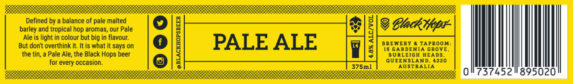
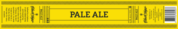
Once we’d agreed that the can design ticked all the boxes, it was time to look at the sticker labelling. The stickers we came up with are quite thin, probably only 20% of the height of the can, so they don’t overpower the aesthetics of the can.
Here’s the Pale Ale sticker:
Here’s how it looked on a mockup that Matt put together:
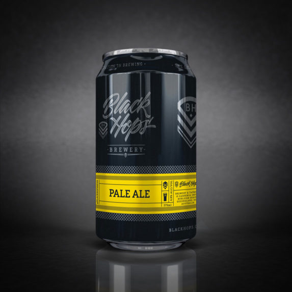
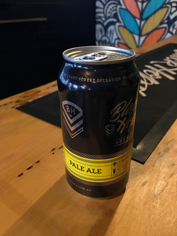
And here’s how the actual can came back from the printers mocked up before the print run.
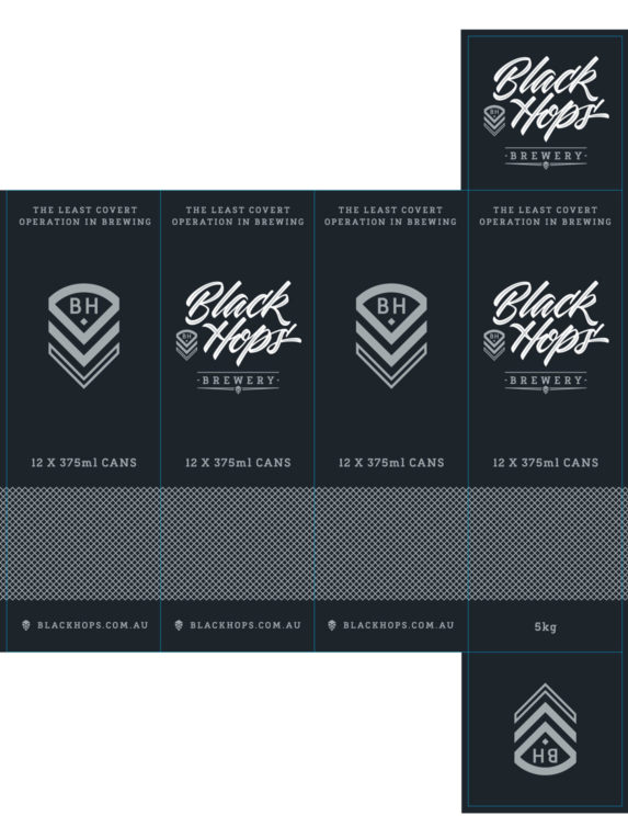
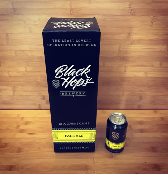
Carton design
With the cans in the bag, we then turned our attention to nailing the design of the cartons. With Pale Ale we were looking for a more palatable price point for entering the market, so we decided to go with a 12 pack option, rather than the traditional 24 pack, to keep the cost under $50.
We also applied the same thinking we had for the can, to the box itself as we were presented with the same challenges. It’s expensive to print full colour cartons, so doing a different one for every beer would be very expensive. Instead we printed a generic carton, and a label specific to the beer.
When we got the proof back from the box company, we mocked up a plain white box with everything in place and realized that the unsightly box edges would be facing up. We moved the elements around a bit to get it right and finalised the design for printing.
And here is the box label.
The idea would be the carton can sit upright for display purposes but would also work with the boxes lying down with the beer name written on the sides.
We designed the box label so the small meshing between the words ‘Pale Ale’ in the social media icons on each side, would be used as a guide to line up against the corners of the box. That way the top would clearly say Pale Ale in big writing, but it would also be written down either side for when the box is stacked traditionally.
Unfortunately when we got the box labels printed they were done at the wrong size, which you can see from the photos below. They are being re-printed and the final boxes will be as per our plan.
But either way we were stoked with how they turned out. We got the boxes yesterday, here’s how they look. Definitely a little bit different to your average carton of beer.
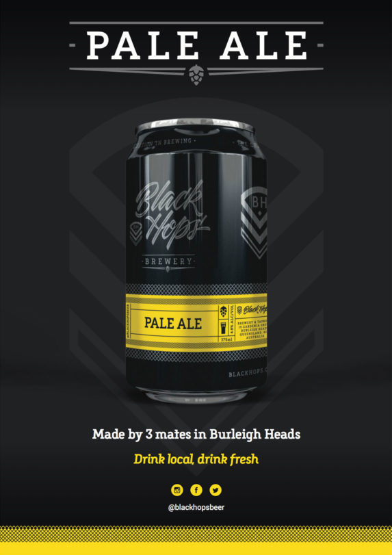
We also put together a few posters and some marketing collateral for the launch. Again Matt did this for us and nailed it (we think).
So far the response has been great and from next week on, with a bit of luck you’ll start seeing it in venues and bottle shops around Queensland.
We have a limited amount of the beer which we’ve divided up into allocations for the Taproom here, our online store, bottle shops and venues. We also allocated 40 twelve pack slabs for pre-sale online orders, which we put up last week and sold out in 2 hours.
We’ve also submitted the packaging to the AIBA packaging award, which you can learn about on our new podcast series here.
We can’t wait to get the beer out, it’s been quite a journey. If you have any questions about the branding aspect or the beer, please let us know in the comments.