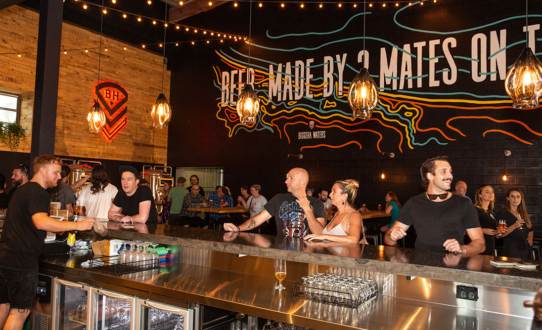
When we set out to build a new brewery we wanted it to be a step up from our humble Black Hops HQ. That’s not to say we don’t love HQ, but we really wanted to take things to the next level with the new brewery.
We were still however on a pretty tight budget, so we weren’t in a position to get designers and architects in to fit the place out. We also thought it would be fun to have a crack at the design aspect of it ourselves, with our builder mate Dan from DCQ Constructions. On the founders trip to the USA, we’d come back with a lot of ideas for BHII and we’d talked about what we wanted in a new brewery and taproom.
So we chatted to Dan to see if he was up for it and of course he was. We then pulled together a brief for the design, including lots of photos and drew up a rough floorplan. The founders discussed the plan and we got to work.
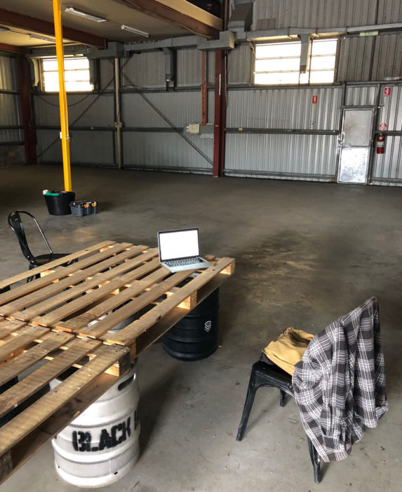
This is a picture of the space before we started.
Design spec
The design plan was put together back in July 2018 when we first got the lease. It included a rough floorplan and some notes about what we were after, along with a bunch of specific ideas I wanted to include and photos of those ideas. Some of the ideas were inspired by our USA trip, others were things I’d seen on Instagram / Pinterest, while others were just little bits of our story we wanted to include.
Here are the high level notes from the document. Further down I’ll dig into the specific ideas and then show the results of what we ended up doing, vs what we had planned. Quite a few things changed along the way, as budget considerations, amongst other things, came into play.
I’ve put my current thoughts below in italics, the other notes are from the original design brief. We also had lots of ideas come in from founders, staff, tradies etc throughout the project that were included, but for the most part we stuck to the original brief.
Aspirational Goals
- Have a thriving homely Taproom on the north end of the Gold Coast.
- Design wise, to have something that picks up elements from the original Black Hops taproom but offers a more complete, stepped-up design. In short, we love Black Hops HQ, but we had no budget to work with then and we think we can improve on it for Black Hops II.
- Have some subtle military elements as part of the design, without being overly masculine.
- We want this to be the best craft beer destination on the north end of the Gold Coast, so it has to look the part.
Materials
- Concrete
- Steel
- Wood
- Glass (if budget permits.) We had plans to put some portholes through to the main brewery, but we decided against it in the end.
Colours
- Dark greys
- Black
- Brown
- Splashes of colour on Mural, Merch shop, Neon Sign etc.
Functional requirements (bar area)
- Wash basin for hand and glass washing
- Dishwasher same as BH HQ
- In-bench glass washer
- Chilled customer-accessed water tap
- Ice machine
- Point of sale IPAD and Eftpos machine
- Individual Glycol fonts for 14 taps. We ended up going with direct pour not glycol taps.
- Holders for tea towels
- Under-bar storage for glasses, kitchen draws, stationery draws
- 15 SQM Cold room
Functional requirements (Taproom customer area)
- 150sqm for the Taproom / customer area. This is a licensing and Council maximum in the new town plan.
- Seating for 60+
- Book-able large tables to seat big groups
- 7m of bar space
- Large display fridge for cans
- Area for merch
Bathroom
- Large bathroom area with shared basin
- Include disabled toilet
Project constraints
- 6 month timeframe
- Tight budget
- Don’t want to make any structural changes to the building
Floorplan
I started with a rough mockup of a floorplan that I did in Photoshop.
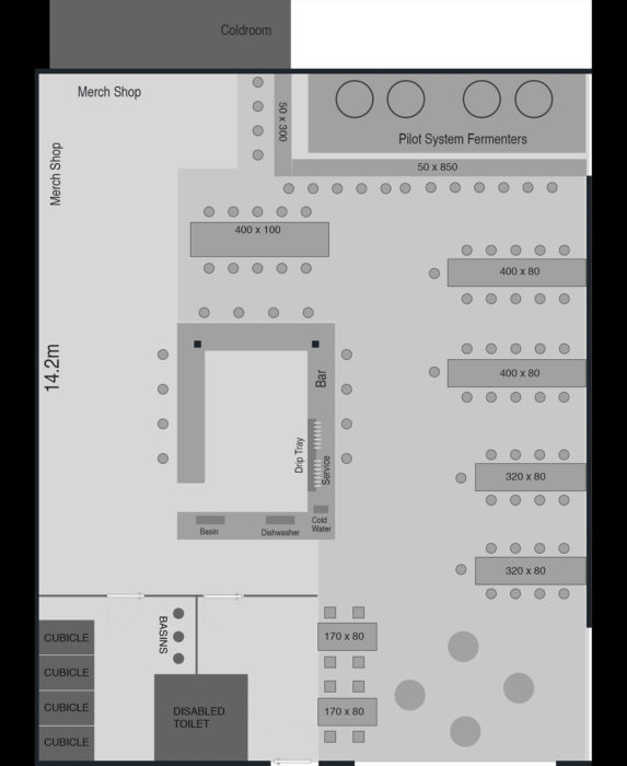
I ended up sending this in order to have a more legitimate floor plan drafted, because we needed it for approval for the toilets.
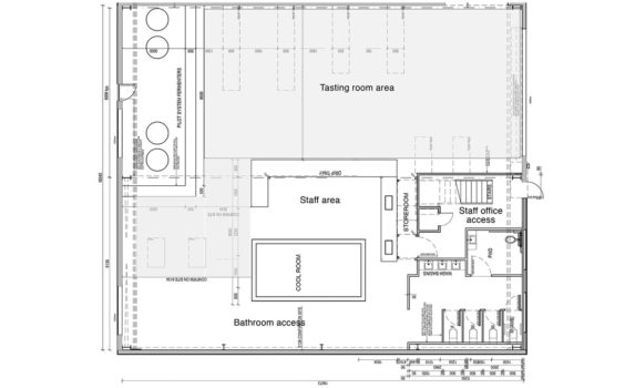
You will notice at some point the design changed from a cold room outside with Glycol lines to a cold room inside, pouring beers direct off the cold room. This decision was made at the time for budgetary reasons, but in the end I’m really happy we changed the design. I think pouring beers direct off the cold room feels right for a brewery, and it’s in line with Black Hops HQ. It also ended up looking like a bit of a supply drop / ammo box, so it worked out well.
Design ideas
Here is the list of the specific ideas I included in the document. Where possible I’ve put a comment about what we ended up getting vs what we thought we wanted at the start, to illustrate how things can change. I’ve also included photos of the finished design where possible.
In the end we were really stoked with how it came out. Looking back at the brief we wanted something that felt like Black Hops HQ, but was a big step up. I think that’s what we got. This is what Urban List said about the space:
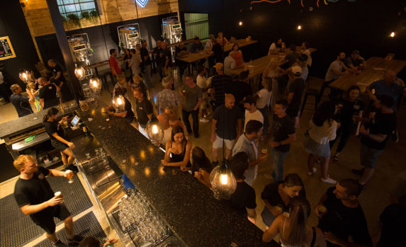
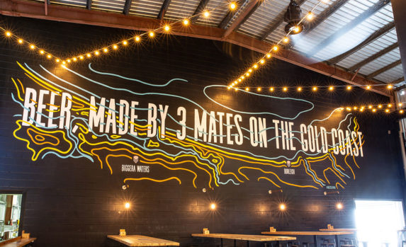
The sprawling 150 sqm taproom is jaw-dropping stuff, from the stunning high ceilings to the hand-blown glass lights, polished concrete bar and quirky art installations, including a giant custom mural from Kiel Tillman featuring the Black Hops slogan, ‘Beer, Made By 3 Mates On The Gold Coast’. Make sure you take extra time on your walk to the bathroom, the light box gallery paying homage to their beer making journey is as hilarious as it is heart-warming. In short, it’s the kind of place you want to come to with your mates and spend all day.
Front left wall
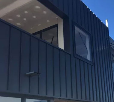
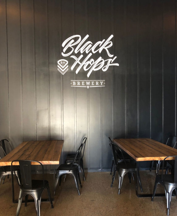
Original note: Clad in board with thin vertical strips, painted black going the length of the wall. Will look nice and clean but inspired a little bit by a container (See example). A big logo the same as our current brewery logo can go on that wall, won’t have to be lit and will give someone a spot to take a photo with our logo in it.
What we ended up with was exactly what we wanted. DCQ cladded the wall in Villaboard and then added the thin strips of wood. Our mate Stevie White painted the wall and Max from Queensland Neon Signs did the Black Hops sign for us.
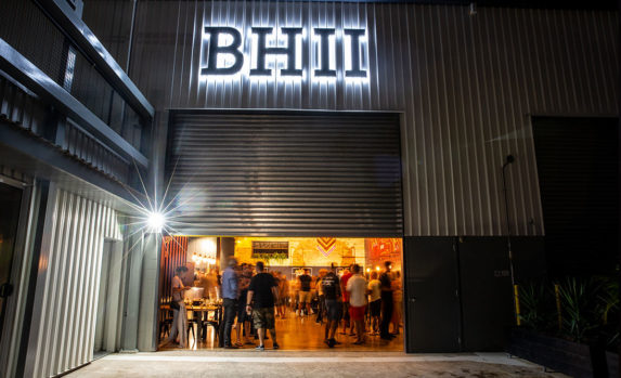
We were happy with it, however after opening at night we realised we did need to light up the sign, so we are adding in a light for that. Here’s a pic:
Pilot bar
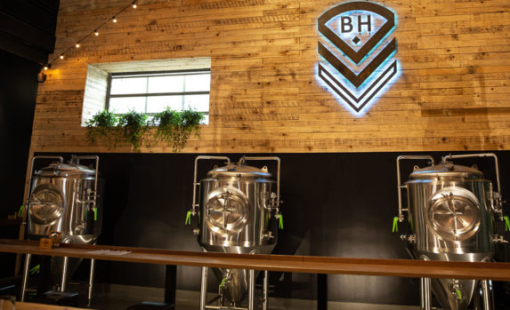
Original note: Pilot system along the back wall and back left wall. Bunding and a bar running full length and separating it from the taproom.
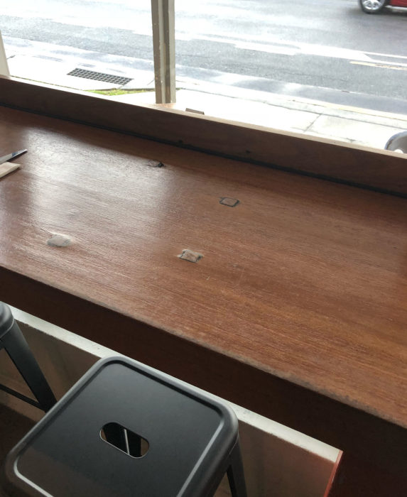
This was a critical part of the design, we were fortunate with Black Hops II that we had enough space to have brewing tanks in the taproom itself. We wanted people to be able to sit at a bar and look over the tanks.
There would be a separate section that is bunded and waterproof, that brewers would be in when needed, with customers right there enjoying a beer overlooking it. The image above is from my local coffee shop BSKT. We built something similar using Blackbutt wood.
Here’s how it looks, pretty much exactly how we wanted it.
Back wall
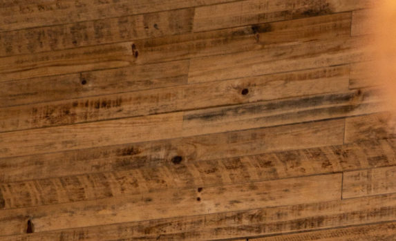
Original note: I’m thinking larger pieces of pine, overlayed on smaller pieces kind of liked stacked ammo boxes, maybe numbers on some of them to look more military with some sort of feature on it. Maybe some sort of steel monogram with a light behind.
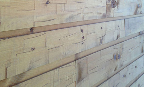
I knew what I wanted here but I couldn’t really find an image to show it. I wanted it to be rough sawn pine, overlapping each other. In the end, we decided not to overlap the timber just because of the sheer amount of wood needed to make it work. That was a bit of a compromise, but we were happy with the overall look of the wall. Here’s the wall close up.
Wall art
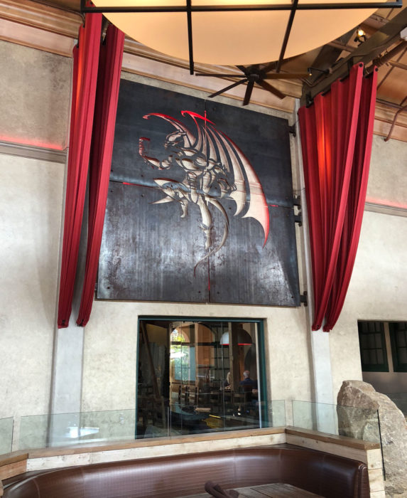
We had seen a cool sign at the Stone Brewery in San Diego and I thought something like this would look awesome for Black Hops, especially with our monogram sign, but rather than cut out the logo shape, we make the steel the actual logo shape and have the LED lights coming out around the logo.
Here’s the sign from Stone:
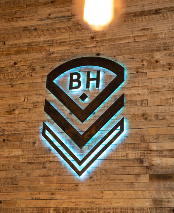
Here’s how our sign ended up looking. It was made from Corten Steel and backlit with LED strips. The LED lights slowly fade constantly into different colours. The sign was made by Max from Queensland Neon Signs. We clad the wall, and then removed the whole section in an un-even matter and he installed the sign on that section and we put it back into the wall. That way you can’t clearly see where the wall was replaced. If you look close enough you can tell but it’s nowhere near as obvious as it would be if we did a straight cut out.
U Shaped Concrete bar
Original note: U shaped concrete bar, serving area on the front, wrapping all around and dish washing / basin against the western wall.
In the end we changed the design to an indoor cold room and direct pour tap system off the cold room. This meant we couldn’t go ahead with the big U shaped bar. However there are many reasons why that turned out to be a blessing in disguise. Here’s an image of the concrete bar I had in the brief as an example that I found online (I actually had a few)

During the process we ended up deciding on a very dark concrete bar with black and light coloured stones in what I think was called ‘night sky’ aggregate. Dan made the whole bar himself and Justin our flooring guy ground it back and polished it. We were beyond stoked with how it turned out.
Merch Shop
Original note: Merch shop around behind the bar. Use Ammo Boxes to hold stock and some racks, maybe a centre shelving unit in the middle so people can walk either side.
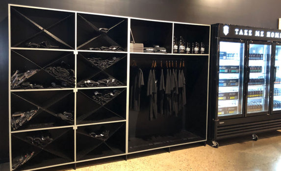
We ended up going with something fairly simple with the Merch shop. I had included this image from Modern Times, which I liked as a way of displaying shirts.
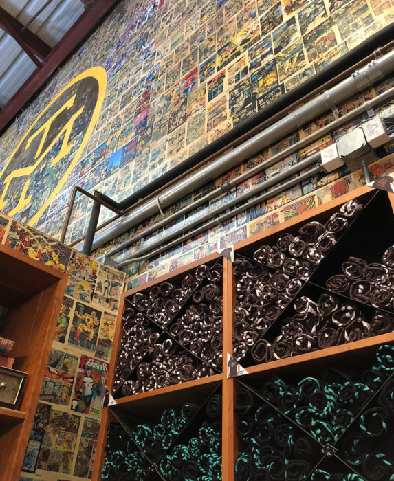
Here is how our merch rack ended up looking. The builders built it onsite using wire mesh for the X sections. We have some signage and more merch to add to it, which will really complete what we were after.
Side wall tables
Original note: Long bar tables (Dark wood similar to BH1) fixed to the mural wall. About twice as long as the ones in the pic below, bolted to the walls, which would make the space feel a bit less temporary and provide an easy place for people to pull up a stump when they walk in (i.e. they don’t have to go to the bar, they can do their own thing, look at the menu and then walk up). Thicker steel than in the pic, more like the one further down.
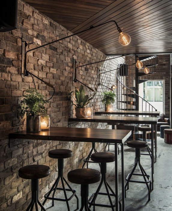
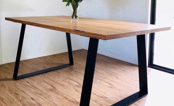
This is what we ended up with. All tables were built from the same cypress pine that our tables at HQ were made from (only new not recycled) and glued together and gap-filled with black filler. The legs were welded up offsite and constructed onsite.
I wanted the tables at the front to be shorter so we had plenty of room for people to feel comfortable after ordering a drink to stand around, and also not overwhelm people as they walked in.
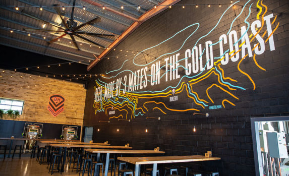
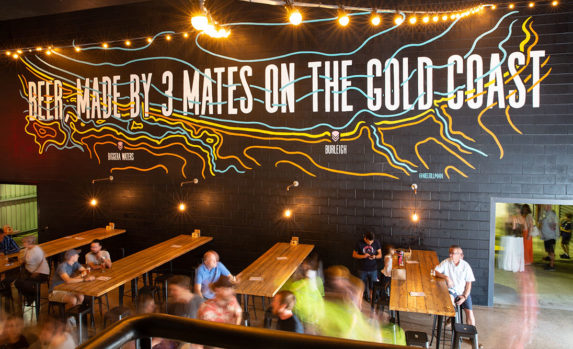
We also had plans for stand up barrel tables at the entrance, but we decided to just leave it all open for now. We can always add them later if we want a bit more space for people to put drinks down.
Floors
Original note: Polished concrete, it’s easy and looks good and it’s an element that continues from BH HQ.
We were lucky that when we ground the floors back and had a look, they actually look really cool – especially considering they are almost 40 years old.
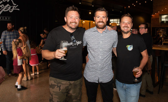
You can get a glimpse of the floors in the pic below, they were ground back 3 times and finished with gloss. The exposed aggregate ended up being a nice looking red colour.
Mural
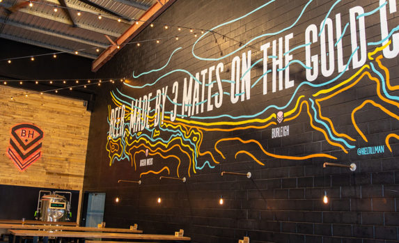
Originally our idea was to put a huge mural on the wall with me, Eddie and Govs shooting beer out of a gatling gun on the back of a hummer. Subtle I know. In the end we went with something a lot simpler. Kiel Tillman came to the rescue with this cool topographical map showing the coastline and our 2 breweries and our slogan.
We were stoked with Kiel’s help because this was getting towards the end of the project and we were stumped for ideas on what to do with the wall. Kiel designed it in one night and painted it within a week. It’s a huge 14m wall.
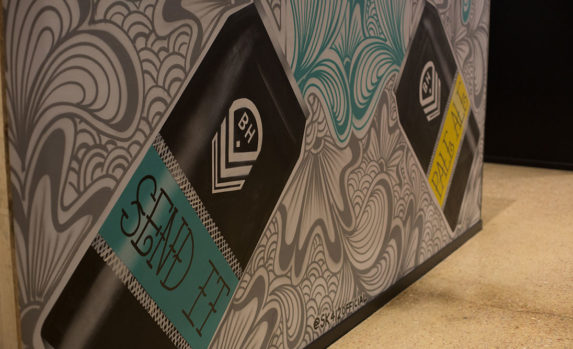
On top of that Eddie came up with the idea of getting Crispy from Sk14 to do something on the back of the cold room. He spray painted a wall at Black Hops HQ and we wanted to bring some more of those elements across to BHII. The back of the cold room was sprayed with a cool can design that Crispy came up with. He does it all with a spray can, very impressive!
Lights
We also had a bunch of ideas for lighting to make the overall design stand out a bit more than the original brewery.
Festoon lights
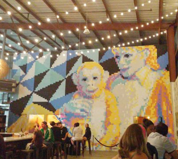
Original note: Fairy lights: from left hand railing upwards toward the top of the mural creating a false roof and blocking out the ceiling and office. We’d paint the office walls black and you’d barely see it unless the lights are on. See the looping fairy lights here from Modern Times. Need to decide whether to loop them like Modern Times (more playful) below, or make them more rigid which is probably more on brand for us.
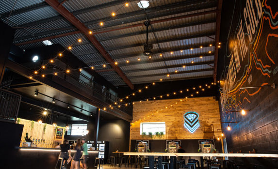
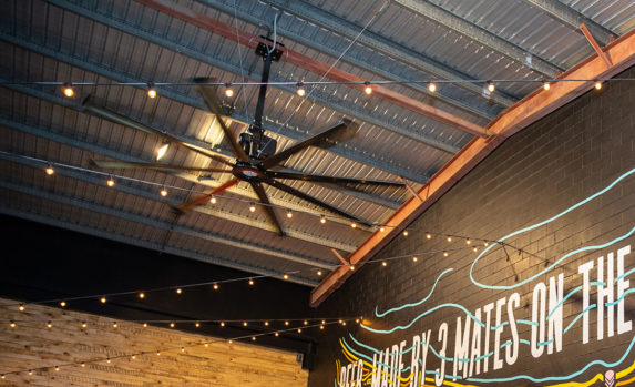
We loved the design of the original Modern Times brewery in San Diego and that inspired some of the design elements at BHII. One was the fairy lights. We ended up hanging them nice and tight so they were more on brand for us, but the concept was the same – heading up from the bar over the customers providing a bit of a ceiling. I was hoping it would hide the ceiling a bit more than it did but I think the impact was more or less what we were after. If we had an unlimited budget we may have hung more lights and maybe even insulated and / or painted or covered the ceiling in black. Having said that, there’s a big part of me that appreciates the fact that you can quite easily tell that the place used to be nothing but a big dusty old shed and that’s kind of cool too. Here is how it looks.
Bar pendant lights and underbar LEDs
Original note: Pendants above bar: Similar to current brewery. Might be good to get a bit more creative with these if we have time / budget. Something inspired by a barrel could be nice if we do something similar with high tables.
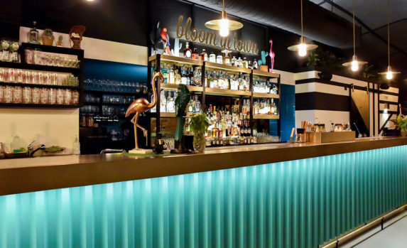
In the end we had the legends at Soktas supply us with some hand blown volt steel blue pendants for above the bar. They are all individually blown, slightly different sizes and shapes and look incredible. You can see them in this pic.
We also ran LED lights under the bar so the bottom of the bar lights up.

Table lights
Original note: Lights over fixed tables: Similar to the ones in the photo below made from copper tubing.
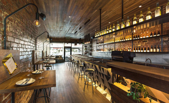
We ended up getting our plumber, Kruges, to make up some plumbing fittings and our electrician, Dave, from One Energy to hook up some lights and bulbs the same as the ones we used for the Soktas lights as the bar. People have commented that they look like beer pipes coming out of the brewery which is cool.
Light boxes
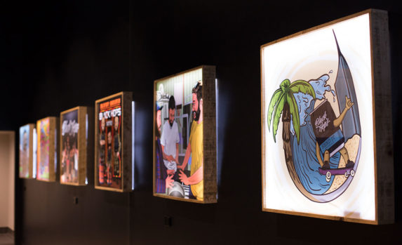
We also wanted to tell our story in the taproom in a quirky way. We had some of our illustrated can designs made into lightboxes by our friends Petridish and hung them gallery style in the walkway on the way to the bathrooms. In addition to our own designs, we found a tiny photo of the Riviera team building boats in this same factory in 1981 and had our illustrator draw that up and hang that on the wall as well.
Ventilation
We also replaced the louvres in the 2 main windows with clear panels so you could see through them, and we boxed around it and filled it with plants. On top of that we put in a wall vent down the bottom of the back wall, and a huge 4m fan above the main bar area. The fan is from a company called Big Arse Fans. It works incredibly well, we have it set to somewhere between 25 and 40 out of 100. When we put it on 100 it felt like it was going to take the roof and fly off. It also looks like a military chopper so that helps.
Everything else
There are some other things included in the design we haven’t specifically covered here. Max from Queensland Neon signs was great coming up with the signs for us. The one we decided on late in the project was the backlit BHII sign out the front which we think is something a bit unique; recognisable to our fans and intriguing for others.
I hope this has been useful, if you want to chat further about the design feel free to ask a question in our Black Hops Ambassador group on Facebook. Either way, we hope to see you soon at Black Hops II, check out the taprooms page for opening hours and contact details.
